collection-view
collection-view对应UICollectionView,在这里做了大幅度的简化,你可以很容易的实现一个瀑布流。
在使用方式上面,跟list元素是一样的。相对于list来说,只是多了几个属性而已。
collection-view属性
| 名称 | 数据类型 | 介绍 | 是否支持绑定 | 是否支持动画 |
|---|---|---|---|---|
| separator-style | Integer(枚举) | cell分割线的样式。默认0没有分割线 | 是 | 是 |
| show-ver-scroll | Bool | 是否显示垂直滚动条 | 是 | 是 |
| show-hor-scroll | Bool | 是否显示水平滚动条 | 是 | 是 |
| columns | Integer | 列的数量 | 否 | 否 |
| column-spacing | float | 列间距。默认10 | 否 | 否 |
| row-spacing | float | 行间距。默认0 | 否 | 否 |
| content-inset | UIEdgeInsets | 内容边距 | 是 | 是 |
| content-inset-behavior | Integer(枚举) | 内容边距行为。iOS11.0以上生效 | 是 | 否 |
附加属性
| 名称 | 数据类型 | 介绍 |
|---|---|---|
| collection-view.column-span | Integer | 跨列数量。 |
separator-style 枚举
| 枚举值 | 对应枚举 | 说明 |
|---|---|---|
| 0 | UITableViewCellSeparatorStyleNone | 没有分割线 |
| 1 | UITableViewCellSeparatorStyleSingleLine | 有分割线 |
例子
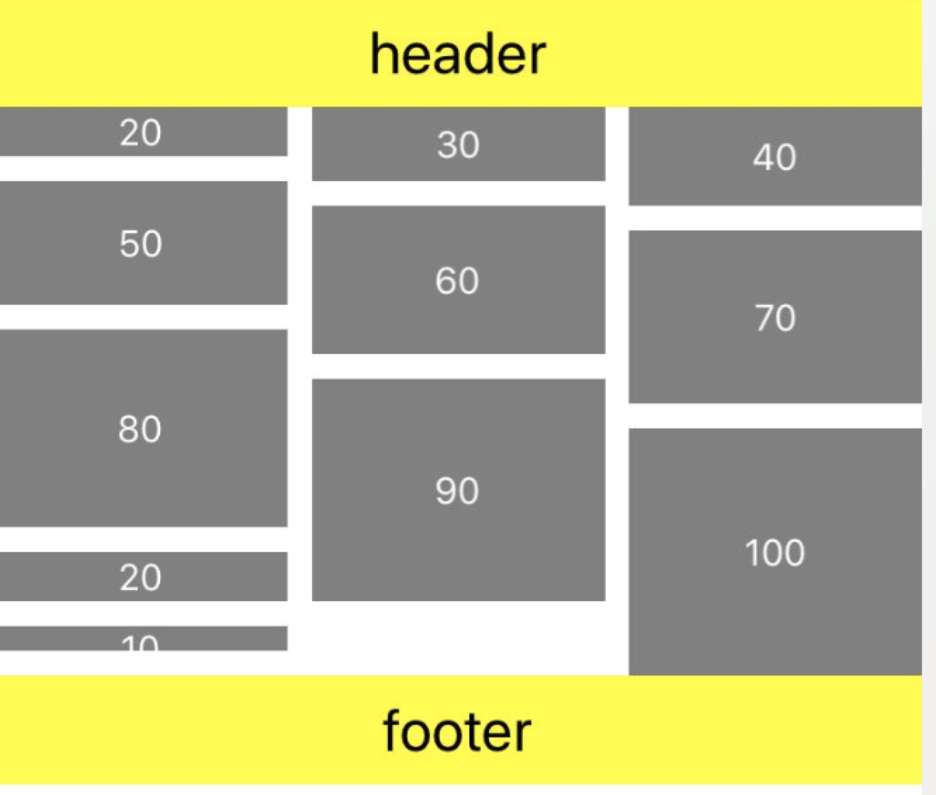
一个简单的瀑布流例子。数据源是每个cell的高度。然后cell的height绑定到数据源上面。
1
2
3
4
5
6
7
8
9
10
11
12
13
14
15
16
17
18
19
20
21
22
23
24
25
26
27
28
29
30<collection-view columns="3" row-spacing="10">
<data-context>
[
20, 30, 40, 50, 60, 70, 80, 90, 100,20,10
]
</data-context>
<!--显式指定高度-->
<header height="44" background-color="yellow">
<dock-panel>
<lable text="header" font-size="24"/>
</dock-panel>
</header>
<!--显式指定高度-->
<footer height="44" background-color="yellow">
<dock-panel>
<lable text="footer" font-size="24"/>
</dock-panel>
</footer>
<section data-path="section1">
<for>
<list-item selection-style="2">
<dock-panel height="{{}}" background-color="gray">
<lable text="{{ }}" font-size="15" font-color="white"/>
</dock-panel>
</list-item>
</for>
</section>
</collection-view>如下图: